
At Bunce, we are building a tool that helps marketing and product teams deliver a targeted and hyper-personalized customer experience to their customers across their lifecycle and journey. Businesses can use customer data to send targeted messages that bring a better conversion rate, lower churn rate, and increase lifetime value.
Building good customer relationships is essential for sustainable growth, so businesses need to personalize how they communicate with their customers, sending the right message to the right customer at the right time. And doing this for businesses at scale is the one job we have.
Part of that commitment is also providing a better user experience for our product, making it easy for our customers to move their first-party data from different sources into our platform quickly.
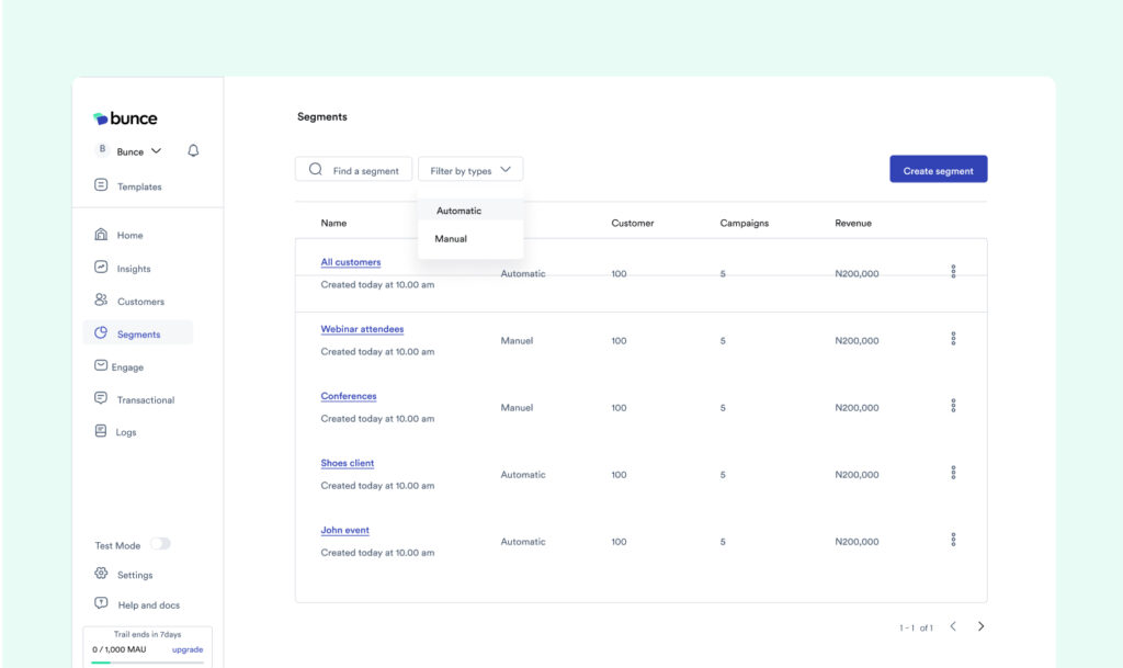
Users can create segments, discover other possible segments to create based on their data, and set up workflows that trigger the right messages to customers when an event, action, or pre-defined condition occurs.
For marketers and product teams to do this, we needed to rethink how we built our dashboard to focus on what is important in helping them achieve their goals. After months of speaking with marketers and product people, creating wireframes and prototypes to test and get feedback, we are thrilled to announce that we’ve launched an all-new Bunce dashboard.
This is where we applaud and cheer our product and engineering teams 👏
This blog post gives you a sneak peek at what you can expect.
Exciting Update to the Bunce Dashboard
Here’s some exciting refresh you’ll meet when you log into the Bunce app.
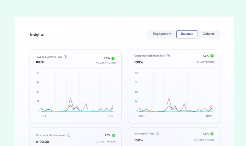
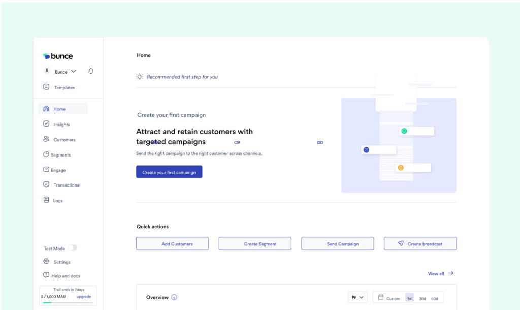
1. Enhanced Dashboard
A visually appealing and informative dashboard to provide you with a quick and clear overview of your key metrics around engagement, revenue, and retention. This allows you to make data-driven decisions at a glance.
1. Improved User Interface
The redesigned UI is easier to navigate, with intuitive workflows, a better segmentation layout, and simplified processes. Sending the right message to the right customer has been made easy.
3. Streamlined Features
We’ve streamlined existing features and made them more accessible to help you improve conversion, retention, and customer relationships.
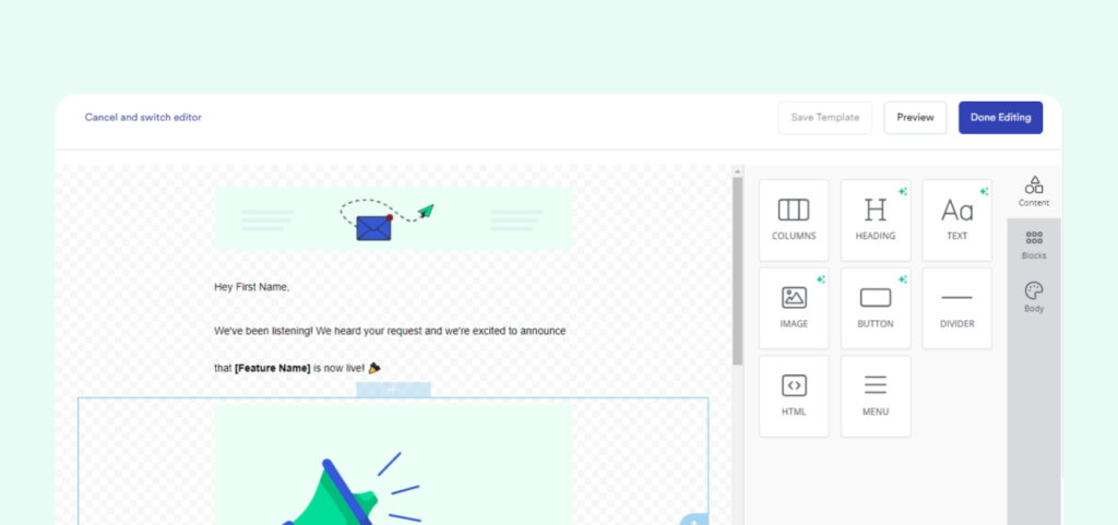
4. Pre-built Journeys and Email Templates
We have created pre-built workflows for different customer journeys – onboarding, re-activation, new sign-ups and more to help you get started immediately, sending the right messages to your customers across different journeys.
Changes to the Pricing Plan
It’s important to note that as part of our updates and as we transition to this improved dashboard, we’re moving away from the previous free plan option to a 7-day trial plan.
For our existing customers, once you log in, you’ll be automatically moved to a 7-day free trial. After the trial ends, you’ll need to choose a paid plan to continue using the platform. We offer different plans based on the number of monthly active users you want to engage.
We’re confident that the new Bunce dashboard will help marketing teams better segment customers, create workflows, send targeted messages that convert, and see their campaign performance in real-time. Product and marketing teams can view their engagement stats and how each campaign translates to revenue growth for your business.
Here’s How to Get Started
- Head over to your Bunce Account: Simply log in to your existing account. if you are yet to have an account, sign up here
- Explore the New Dashboard: Navigate and see how easy, and fast it can be to get anything done on the platform.
- Start Crafting Powerful Campaigns: With the intuitive interface and powerful segmentation tools, creating targeted campaigns has become easy.
Cheers to more revenue growth.